Local Art Collective is a Vancouver (Canada) based t-shirt store that is trying to promote local artists by selling t-shirts. This review is going to be rough and not because I get off on being mean but because I think that if this site has any chance of surviving, much less prospering, there needs to be many changes.
The idea behind our company is simple: sell clothing with designs created by local artists, submitted by local artists, using only the finest fair trade clothing (American Apparel) and printing all garments in good ol’ Vancouver.
Logo
I like the logo. Even though it’s not exactly original, it is simple and includes the whole name of the brand which is clever considering that it’s a practically unknown brand. We don’t need to recognize the logo, the name is on it. It would also be simple to change it to different color schemes in the future if they ever wanted.
Site Design
I also like the appearance of the site. It’s very simple with lots of white space and it utilizes only grays and blacks. Even the home page photos and product images appear muted giving it a classic photo book vibe. The navigation is simple text with no mouse over effects. It’s very easy to understand and doesn’t even take away from the photo book style.
The logo is included in a big banner in the header which pushed the important content a little far down the screen but really not that far, unless you are using a tablet or smartphone in landscape mode. If possible I would minimize the header though, at least on all pages except the homepage.
I like the simple navigation but I have to wonder why there are two links to the shopping cart. I guess the black link with the rollover effect is generated by the shopping cart software and it is dynamic so I would keep that one and remove the other from the menu. I would also align it with the navigation and re-style it a little to match the site. But hey, that’s just me. I’d also want to have the same amount of white space above and below the navigation menu. I know. I’ve got problems.
Apart from those niggly issues I have with the navigation, my first impression of the homepage was very good. I love the gallery of images. It reminds me of the WordPress tiled galleries but looks even better. Of course if it’s manually created rather than automatically generated it should look better.
There is a problem though. None of those well-shot photographic images are clickable. At least they should all link to the t-shirt store page (CLOTHING in the menu) but ideally each image would link to the tee featured (or predominantly featured). Alright, the store is not very big yet and it is pretty easy to find the tees from the photos but why not save the shoppers a click. When/if the store gets bigger and the shop has multiple pages of t-shirts it will be more important.
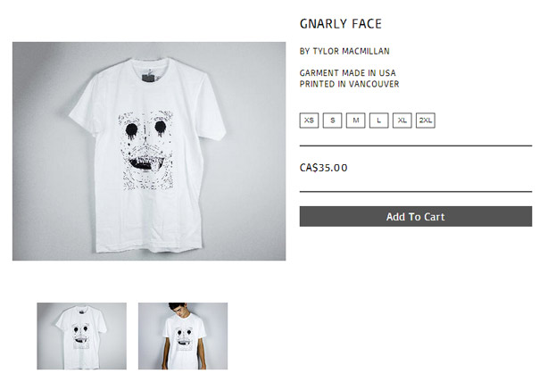
The product page appears as a pop-up from the shop page which is pretty cool and gives the appearance of loading quickly. It has an alternative model image which is great, the artist’s name and of course the title of the shirt.
Product Images

On the shop page the product images are OK but perhaps because of the thin line styles of the designs it isn’t easy to see the designs and there is no zoom feature. That magnifying glass that appears when you hover over the image isn’t a zoom, it is basically the product page in a pop-up, with a few details. (See image above.)
The T-Shirts
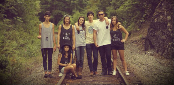
Each to their own but I think this is an area where they fail. And being a t-shirt store, that’s a problem. To me, the designs look like they were sketched on a piece of paper and then transferred somehow to the gray and white canvasses of the tees and tanks in the store.
I can’t understand who their target is. Apart from the zombified Johnny Cash I don’t know what the designs are about. I don’t know what Zombie Cash is about either really but at least I recognise the elements and I know that there is a market for both Johnny Cash and zombie tees.

It’s a tough call to criticize art and I’m not saying it’s bad art. It’s not to my taste but that’s irrelevant. But it’s very difficult to sell t-shirts with random designs and even more difficult if you can’t even see what the design is. If the artists are famous or there is a pre-existing market for your product you’ll have a chance but I don’t think that is the case here. I can’t even see what the designs are supposed to be in most cases here.
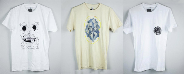
Looking at the first three tees displayed in the store and this is what I see.
- A messy A4 sized monster face doodle
- I don’t know
- Indistinct circular pocket logo
What do you see?
There are four logo tops too but really, who cares? It’s too early for them to try thinking about selling logo tees because they are an unknown. I guess they might be useful for promoting their brand and make good conversation pieces when the owners are out and about, but apart from that, I can’t imagine anyone outside their circles would be interested.
Shopping Cart
The design aesthetic gets lost in the shopping cart but it is easy to use and understand. PayPal is the payment gateway but of course you can pay with credit cards through PayPal. At the moment they are only shipping to the US and Canada.
Navigation
The navigation is very simple and easy to follow but I think they are missing a few things. Where are the links for the FAQ or the Help pages. I suspect that these pages haven’t even been created. In the site design section above I mentioned about the some design details so I won’t rehash it here. I don’t see any links to social media either and I will talk about that more down below.
SEO
Either Local Art Collective know very little about SEO or they put little stock in it.
First of all lets look at the domain and site name. Local Art Collective. It is actually a great name and one that I think can easily get good ranking and therefore traffic. However, I think that most people who search Local Art Collective and find this site will be disappointed because really it’s a Vancouver Local Art Collective. People will more than likely be searching for local art collectives in their own localities. Of course vancouverlocalartcollective.com would be a ridiculously long url and I’m not suggesting that but I think Vancouver or British Columbia could be used in the page title. Especially on the home page.
This is what displays in the Google search results at the moment:
Local Art Collective
www.localartcollective.com/
Supporting local art through the medium of clothing.
Wouldn’t something like this be better:
Local Art Collective – Cool T-Shirts by cool Canadian artists!
www.localartcollective.com/
Buy cool tees and support Canadian artists at the same time.
If you want to get relevant traffic from Google almost anything would be better. So basically page titles needs to worked on. As well as site meta-descriptions.
Text: apart from the About page there is practically no text on the site. No text on the homepage and no blog. You need text and relevant text to get traffic. The home page should have at least a blurb to tell the world (or just the US and Canada) what the site is about. A regularly updated blog would also help bring traffic to the site. There are a few people involved in the site so I think this would be easily doable. And if they are really interested in promoting Vancouver art and artists this is a great place to do it. If they posted about local artists with links to blog and websites they would more than likely get some reciprocal links and traffic to localartcollective.com.
Images: they need to include img and title tags in order to have a chance in being included in image search results. Images with links and proper tags can really improve your site with regard to SEO.
Selection and Pricing
CA$35 (just under US$35 at the moment) seems a little steep for American Apparel tees. If the designs were more impressive it might be acceptable but I don’t think they are going to get too many takers, at least not on the web. Although, I admit I don’t know the typical prices of tees in Canada. The selection is poor with just a few uninspiring designs and logo tees. The logo tees are CA$30. At least they understand that they are worth less but they are still asking people to pay $30 to promote their brand.
Social Media
From the website you wouldn’t know that they have a social media presence at all but on the off-chance I Googled it. They have a Facebook page and are on Twitter. 326 Likes and 237 followers. Not bad for a new brand. They are both updated regularly. There really should be some links from the website to their social media platforms though because I don’t think that many people will bother Googling like I did. Every fan and like is a potential sale or promotion. They could get on Pinterest and search for other Vancouver artists and re-pin, make contacts and network.
Wrap-up

In markets and other physical retails stores I think that Local Art Collective has a better chance of selling their product but I don’t really think the web store, in its present form, will generate any sales. Perhaps when people see them at their stall at some local market and don’t have cash at that time they may purchase them later through the web store.
First and foremost, I think they need t-shirts that really stand out because on the internet there is a huge and ever-expanding selection to choose from. If the tee designs don’t scream “You need me!” then you will need some amazing marketing talent.
Next, if they want to get generic search traffic they need to learn about SEO and probably keep a regularly updated blog. They should also integrate their social media more and perhaps add sharing buttons to make it easier for people who might want to do that.
The site needs to be updated with more text for SEO reasons and also to include more information such as return policies, shipping schedules etc.
Basically I think what we have here is a bunch of friends getting together and trying to start a business. But nobody really has a clue how to go about it. Creating a web store and putting a few products in it does not guarantee success. In fact, I imagine failure is almost guaranteed. Unless dramatic changes are made, or sales in physical locations are very good, I really don’t expect them to be here this time next year.
Local Art Collective: Website | Facebook | Twitter


Please comment with your real name using good manners.