What does “Artistry is Dead” mean? That’s a good question and unfortunately I don’t have the answer. I read the blog post on their site about it but it was mostly an incoherent rant. I mean, after reading it, I don’t know if they are trying to say that art is dead or it isn’t dead. I do think they are pro-art though. Check out the blog post for yourself. (You will have to scroll down because they have the blog posts embedded in the site in a way I can’t link directly to the post.) One thing I do have to say about this post is that I think he is right about DaVinci not working 40 hours a week in a cubicle staring at a screen. I think that if someone with his talents and inclinations were born into this generation he would probably spend about double that. He was after all a commercial artist with big ambitions and as I’m sure old Leo himself would say “the web is where it’s at”.

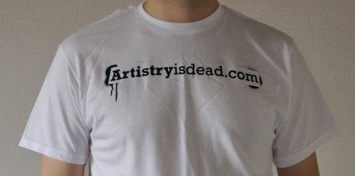
Anyway, lets talk tees. The above tee is their basic logo tee, if that wasn’t already obvious. The logo contains the url so people who see it can easily find the url. The store name has a bit of an impact so I think that some people would check it out. Especially in these always connected days. Just picture it. You are sitting on a train and you see this bold statement built into a url. “Wow! That’s a bold statement. Let me whip out my HTC Desire HD and type that into my browser and see what’s up.”

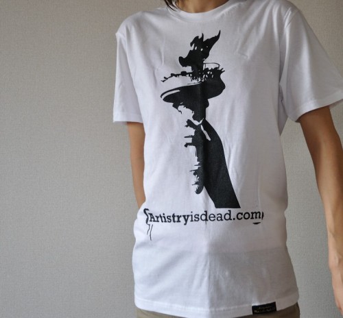
This second t-shirt is basically a logo t-shirt too that utilizes what looks like a hastily vectorized image of the one of the biggest icons in the world, the Statue of Liberty. The vector is not bad but what’s with the big logo/url. I know you love your own brand but come on. We don’t need to advertise your business while we wear your shirts. I like the little tags at the bottom of the tees though. I always feel that they make a tee more professional looking.

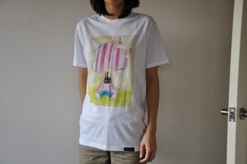
The third tee is the only decent tee that was sent to me and even it has some issues. Let’s start with the artwork. I have to admit that I like it. It’s cute and at the same time a little scary. I don’t know what’s going on in the picture. We see somebody lying at the trunk of a tree but that’s about it. Is he sleeping? Is he dead? Is he even human? Images that make you ask questions/think are pretty cool. The problem I have with the design though is that it is just a rectangular image on a tee. I think tees deserve a bit more. With todays printing options there is so much more we can do. The rectangular prints always remind me of iron prints.
That’s my review. I know. I wasn’t overly kind and it was far from a glowing review but whoever sends me a tee knows the risks. I hope that some of the information provided here will be of help to the guys and Artistryisdead.com and I do want them to be successful. To be honest though, when I received these tees, I felt as if they sent tees that are not selling. That it is one way to get rid of them or something. There are some good tees on the site. If I were sending a tee to a blog to be reviewed I would definitely try to send the tee/tees that I am most proud of rather than some simple logo tee. It would surely increase the chances of a glowing review.


Please comment with your real name using good manners.